About
Hi.
I'm Zach Lee, a Boulder-based graphic designer and I absolutely love cycling.
Some projects come to life because they need to.
This wasn’t commissioned by a client, agency or institution. This is something that has been taking space in my heart and head for over a decade (the last 2 years taking real shape).
_____
Any good map, if anything, is the start of an adventure.
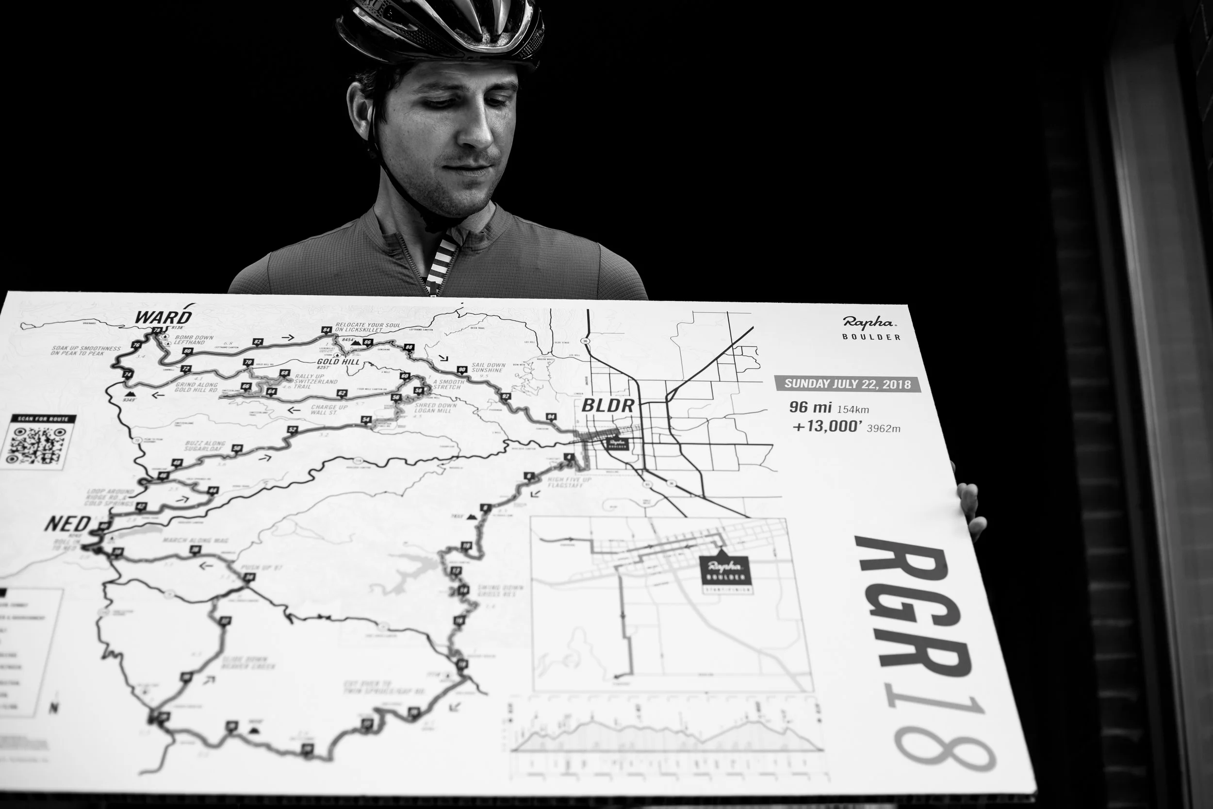
It doesn’t need to tell you everything, nor should it. Because of our unique topography, most rides start with the intent to head WEST to climb into the mountains or EAST to roll onto the plains. So that’s how I’ve oriented the map, WEST UP. Once you’ve decided on a direction, the possibilities open up. This is what makes Boulder such a special place - the abundance of connected paved roads, gravel roads (groad), and trails. We have the tendency to ride the same loops, which become overpopulated, boring, and downright unsafe at times. This map project is based on collective knowledge from locals who have been riding in the area from the early Coors Classic years to the present, and illustrates routes in a clear and useful way, specifically for cyclists. Even if you’ve lived here for years, you’ll see something new.
_____
Why a paper map, when there’s technology?
It’s simple. Once you know where you are and where you’re headed, you can enjoy your surroundings. Think of a subway map. The work of Harry Beck for the London Underground Tube Map and Massimo Vignelli’s NY Subway Map became the starting points of a universal system and style. A method of over simplified communication to describe complex networks. I mean, do you really need to know all the geographical accuracy in every twist and turn in the road?
It’s easy and fast to understand. The map also takes cue from ski resorts and mountain bike parks. I can give it to my wife (and not by coincidence, my muse), who likes to be spontaneous and informed at the same time. She has just enough information to know what to expect. The roads are color coded for levels of difficulty (again, based on feedback from the cycling collective).
It’s tailor oriented to our specific locale, the base of the rocky mountains, and tells you only what you need as a cyclist in this area (mileage, elevation, difficulty, water/food).
It’s scaled to the natural range/distance of cyclists, not to invisible city and county borders
It’s damn durable. It’s water and sweat proof, tear resistant, fits easily in your jersey pocket, and did I mention it won’t run out of batteries?
_____
This project deserves to evolve with time and input.
With continuing feedback, I’ll produce future editions and plan to expand to other cities.
I hope - at the very least - the map connects cyclists to this beautiful area. If this inexpensive, tangible tool helps you feel informed and inspired to explore the area by bike, then it’s done it’s job.
Know that it was created locally, out of love for the sport, for the area, and with unfailing gratitude for the incredible cycling culture in Boulder.
_____
CLIENTS
Boomtown Accelerators (where I’m currently Head of Design)
CrossVegas
Donnelly Cycling (previously Clement)
Mosaic Cycles
Point6
RockyMounts
Skratch Labs
Valmont Bike Park
WhiteWave
Zayo
